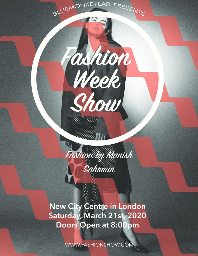
Proximity: All the information is separated according to if they are related or not and all related fonts are grouped together.
Alignment: Center
Repetition: You see a repetition of the red zig zag lines going horizontally across the photo.
Contrast: The contrast of the dark background and the white word allows the information to pop.

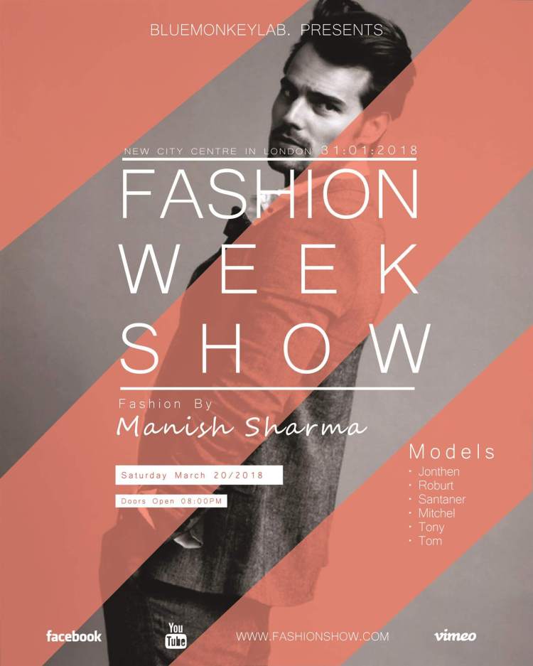
Clear connection to original poster through imagery, color, and font. In terms of the design, the feedback I have is to be bolder with contrast and make the title more distinct with either a larger scale or a chunkier weight. I also would have liked to have seen more discussion of your design principles – there are many more examples of repetition and contrast here. For example, different fonts at different sizes at different weights in different forms (CAPS).
LikeLike